I have written about line weights in the previous post of this blog. I would like to talk more about line weights in term of their implementation to drawings. Some may have a question about what the difference between line weights and line widths. They essentially are the same meaning but people use them differently. Most common use is the term “line weight”. In the history of making a drawing, we actually press the weight to a pencil to control the weight of a line. In the modern era, much of drawings are being produced via computational tools then drawings are being printed via printers. A printer controls the thickness of lines by using a width of lines to differentiate a thickness of lines. Therefore, the proper term for all lines that being produced via a printer should be called line widths.
Line widths play a significant role in architectural drawing. Without line width controls, we may not be able to effectively communicate the depth of drawings as we intended to. The examples above will offer you an idea and the outcome of drawings that is drawn with or without utilizing line widths as a method of conveying depth in building floor plans.
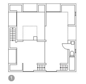
The image no. 1 is using a single line width. Using a single line width makes the drawing difficult for a viewer to read the drawing and differentiate between solid matters and spatial voids in a drawing particularly when a drawing is a complex one. Therefore, using a single line width in drawings for communication purposes is not recommended.

The image no. 2 is using a hierarchy of line width to differentiate between solid matters and spatial voids. It is a commonly use in architectural drawings. The method helps facilitate the readability of a drawing very well when the line widths are implemented effectively. There are three line widths were used in this drawing: think (.35 mm or 1 pt), medium (.18 mm or 0.5 pt) and thin (.09 mm or .25 pt). I personally often use this method of convey the depth of my drawings because it is simple. However, this method may not work as we expected it if a drawing is created in a small scale (1/16″=1′-0″ closed to 1:200 in metric or smaller), particularly, when a viewer has to view this from a far distant. Consequently, the method of conveying drawing depth in the drawing no. 3 is more appropriate for presentation of small scale drawing perhaps.
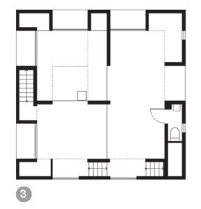
The drawing no. 3 is utilizing a technique called “poche”. It is a process of darkening the cut area of the solid elements such as walls, columns, etc. It is commonly used in building floor plan drawings and building section drawings.. Since the technique offers a strong contrast between spatial voids and solid element in building floor plan drawings, it is a lot easier for a viewer to quickly conceive the depths in the drawing. The poche technique in drawings is an ideal method of representation in drawings that are created with small scales, and being seen from a far distant likes presentation for a client in a meeting room with a group of people or pin-up situation in school project review.
One response to “Line Weights No.2: Implementation”
[…] particularly the 2D architectural drawings such as plans and section drawings. I wrote about the line weights in plan drawings in the previous article. The article will help you understand how line weights can render depth in […]