Depth is a fundamental element that must be sustained in painting and drawings. With depth, graphics will be more visually inviting. Decreasing understanding of how depths are created will enhance the quality of visual communication in drawings and paintings. The insight gained from this article can apply to analog and digital drawing. Yet, it also applies to two-dimensional architectural drawings such as plans, sections, and elevations. This article aims to support architectural students looking to learn more about depths and how they can apply them to their drawings. Let’s dive into the detail of the topic and multiple elements can generate depth:
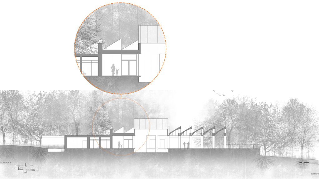
- First is line weights, particularly the 2D architectural drawings such as plans and section drawings. I wrote about the line weights in plan drawings in the previous article. The article will help you understand how line weights can render depth in a drawing. The example illustrated below showcases the sophomore student’s drawing on implementing lightweight and poche techniques to generate dept for section drawing. The cut elements are drawn with the heaviest lines, and the objects beyond the cut line are marked with lighter line weights. With two – three various line thicknesses, viewers will be able to distinguish distances in a drawing.

- Second, generating depth by using tonal values. Without using perspective, tonal values are one of the vital aspects of traditional painting, and this understanding can also apply to architectural drawings to develop visual depth. The example below demonstrate the usage of tree foliage masses as a background to reveal the positive shape of the building in the sectional drawing. Indicating the distant background by lowering the foliage tonal value or its intensity. By doing so, the depth in this drawing begins to appear. In addition to generating depth using tree foliage, it develops an atmosphere in the picture. In this example, the drawing appears with the surrounding context adding story to the image. The illustration extends beyond architectural information and narrates how the building connects with the surrounding environment. Together, the line weight and tonal values strengthen the visual depth in the architectural drawings.

In part two, I will discuss enhancing depth in drawings in detail using edges and perspectival techniques.
